Windy Tailwind: Bootstrap to Tailwind
Beyond Code has developed Windy Tailwind, a remarkable tool for creating Tailwind CSS components from existing website elements.
In this blog post, we will explore the best 10 Tailwind CSS component libraries that can supercharge your development workflow. These libraries offer ready-made UI components with all their styling and interactivity already built-in. Think buttons, modals, navigation bars – you name it!
Welcome to the exciting world of Tailwind CSS! If you're a web developer or designer, chances are you've heard of this powerful utility-first framework that has taken the industry by storm. With its simplicity, flexibility, and speed, Tailwind CSS has become a go-to choice for building modern and responsive websites.
But here's the thing: while Tailwind CSS provides an extensive set of utility classes out-of-the-box, creating complex UI components from scratch can be time-consuming and tedious. That's where component libraries come in to save the day!
Choosing the right component library is crucial as it not only saves valuable development time but also ensures consistent design patterns throughout your project. So let's dive into some key factors to consider when selecting a component library for your next project!
When it comes to building a website or application, using component libraries can be a game-changer. These libraries provide pre-built, reusable components that make the development process faster and more efficient.
One of the key benefits of using component libraries is consistency. With a library in place, you can ensure that all elements across your site have a unified look and feel. This not only enhances the user experience but also saves time by eliminating the need to manually style each individual element.
Another advantage is productivity. Instead of starting from scratch for every new project, you can leverage existing components from the library. This means less code to write and fewer bugs to fix since these components are already tested and optimized.
Component libraries also promote collaboration among developers. By having a centralized collection of components, team members can easily share and reuse code snippets, leading to better teamwork and more streamlined workflows.
Moreover, using component libraries helps with scalability. As your project grows and evolves over time, adding new features or making updates becomes much simpler when you have a foundation of reusable components at your disposal.
In addition to these benefits, component libraries often come with documentation and examples that make it easier for developers to understand how different components work together. This reduces the learning curve for new team members joining the project.
Incorporating component libraries into your Tailwind CSS workflow offers numerous advantages such as consistency, productivity gains, improved collaboration amongst team members,and enhanced scalability - all crucial factors in creating successful web projects!
Factors to Consider When Choosing a Component Library
Choosing the right component library for your Tailwind CSS project is crucial to ensure efficiency, productivity, and consistency. However, with so many options available in the market, it can be overwhelming to make a decision. To help you navigate through this process, here are some factors to consider when choosing a component library.
1. Customizability: Look for a component library that allows easy customization according to your project's needs. The ability to modify colors, typography, and other styling elements is essential for maintaining brand identity.
2. Documentation: A well-documented component library provides clear instructions and examples on how to use its components effectively. This saves valuable development time and ensures smooth integration into your project.
3. Active Development Community: Choose a component library that has an active community of developers contributing updates and bug fixes regularly. This ensures that any issues or bugs encountered during usage will be resolved promptly.
4. Responsiveness: Ensure that the components in the library are responsive by default or provide options for responsiveness customization across different devices and screen sizes.
5. Performance Optimization: Opt for a lightweight component library that focuses on performance optimization techniques like code splitting, tree shaking, or lazy loading of assets.
6. Cross-Browser Support: Check if the selected component libraries support major browsers such as Chrome,
Firefox,Safari,and Edge,to ensure consistent user experience across different platforms.
7. Integration with Other Tools/Frameworks: If you are using additional tools or frameworks alongside Tailwind CSS (e.g., React or Vue), make sure the chosen component library seamlessly integrates with them without conflicts or compatibility issues.
Remember these factors when selecting a Tailwind CSS component
When it comes to choosing a component library for your Tailwind CSS project, there are plenty of options available. Each library has its own unique features and advantages, making the decision-making process a bit overwhelming. To help you make an informed choice, let's compare the top 10 Tailwind CSS component libraries.
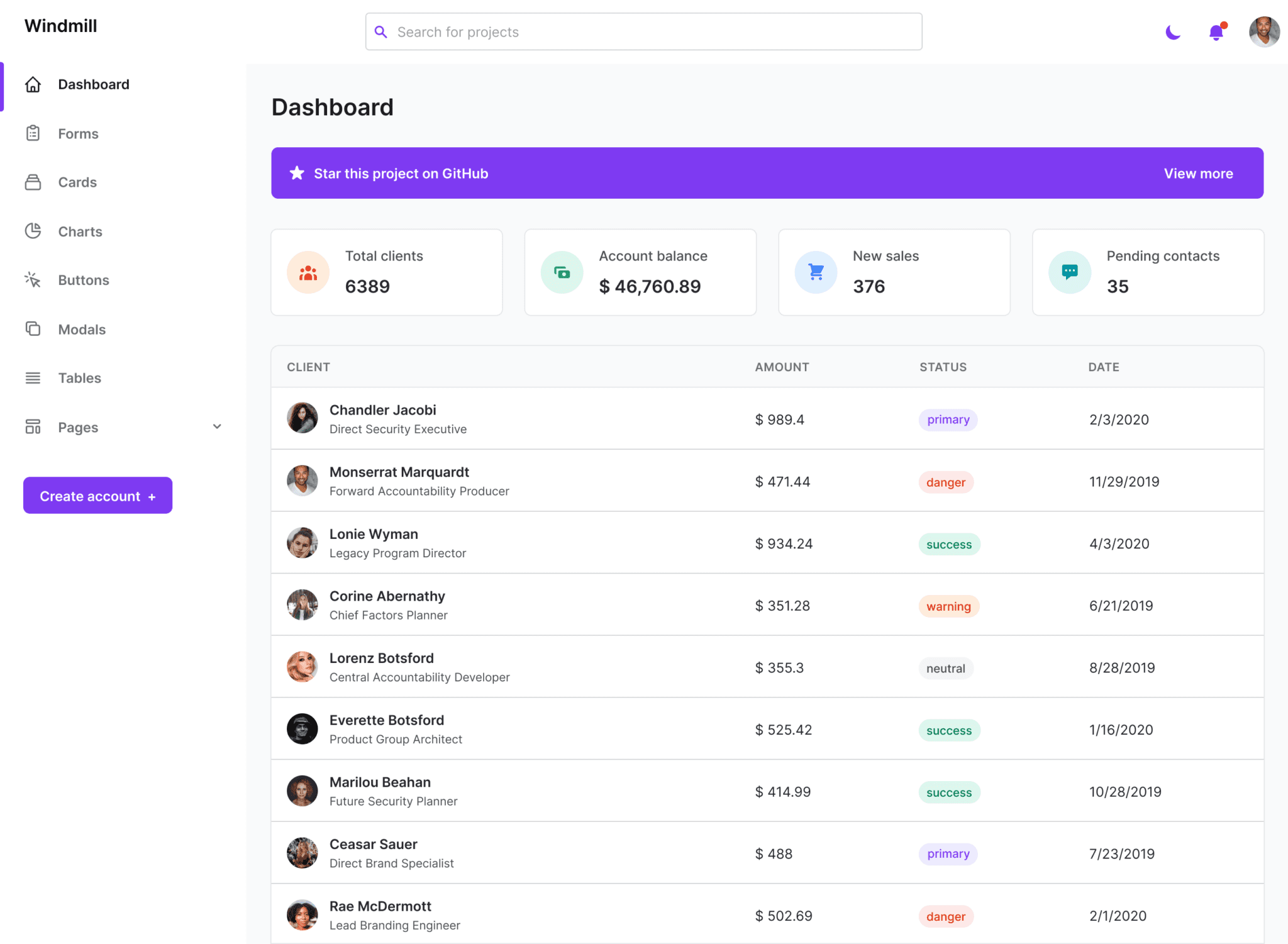
Known for its simplicity and clean design, Windmill UI offers a wide range of ready-to-use components that can be easily customized to fit your project requirements. It comes with Windmill Dashboard HTML, Windmill Dashboard React and Windmill React UI.

This library provides lightweight and accessible components that can be used across different frameworks like React or Vue.js. It is perfect for building interactive interfaces with ease.
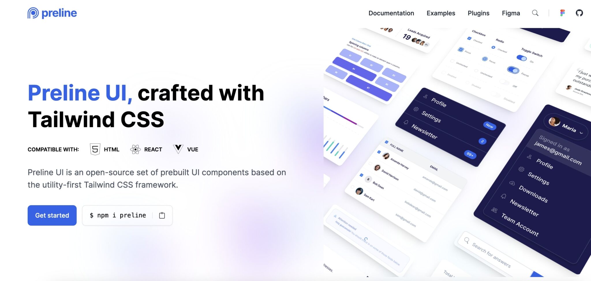
The Preline UI offers the largest Figma-free design system with lots of bells and whistles, including 300+ prebuilt Tailwind CSS components.
Layouts, navigations, forms, alerts, buttons, cards, and other base components can be built using the components. Additionally, Tailwind CSS plugins are available, such as accordions, tabs, dropdowns, and modals, which are not included in the core framework.
The Preline UI includes installation guides for most major frontend frameworks as well as documentation on customization, theming, and dark mode.

A rich set of components and utilities are provided by ripple UI, another great library for building modern interfaces.
Ripple UI can be installed as a plugin or as a CDN link. It provides starter project examples for many frontend frameworks, including Vue, React, Svelte, etc.
In addition to its default theme, Ripple UI allows you to create, modify, and remove your own custom themes. It also supports automatic dark mode.
The basic idea of Ripple UI is to offer classes like Bootstrap, but with the flexibility of Tailwind CSS. This makes it handy for projects that require a modern look and feel, as well as a full set of components.
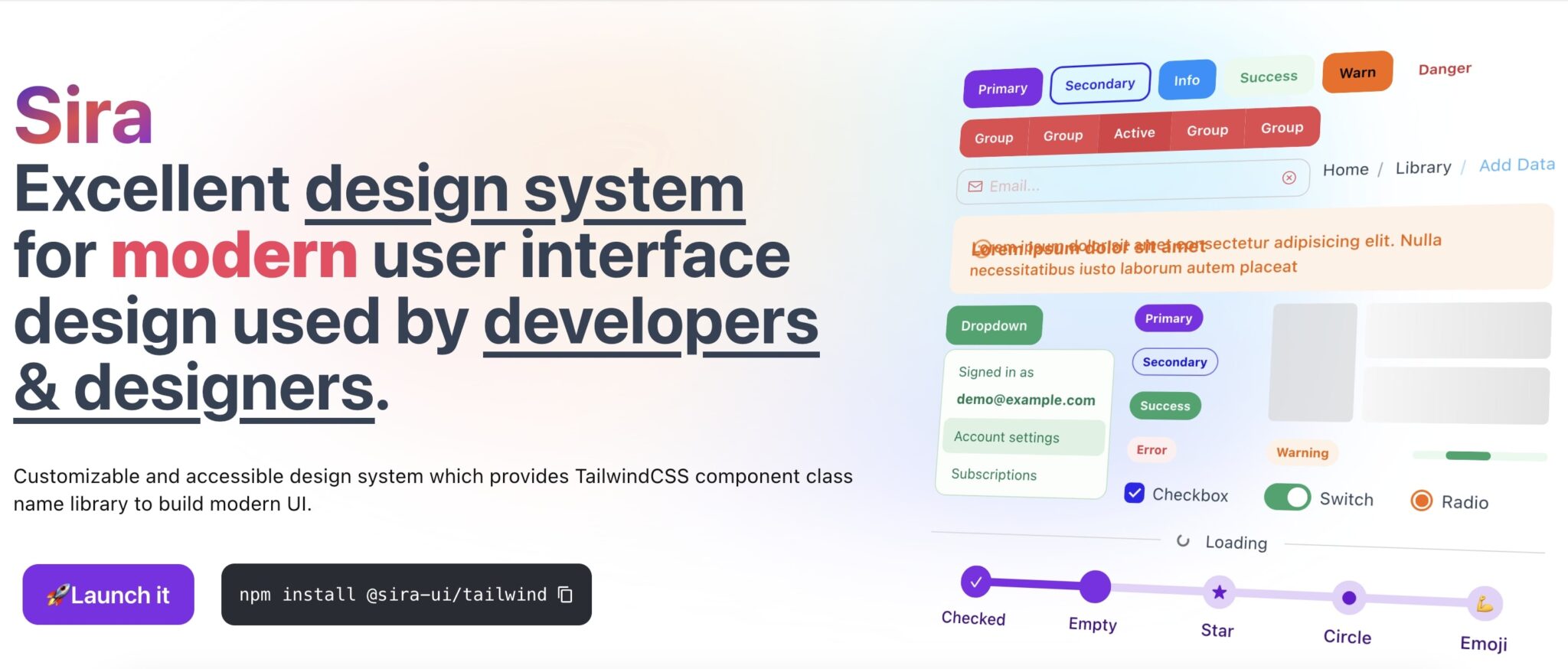
Known for its beautiful design system, Sira is compatible with Vue, React, and other popular frontend frameworks.
In Sira, you can create complex interfaces quickly and easily through predefined Tailwind classes and styles.
Installing this Tailwind CSS component library as a plugin and further customizing and theming can be found in Sira's documentation.
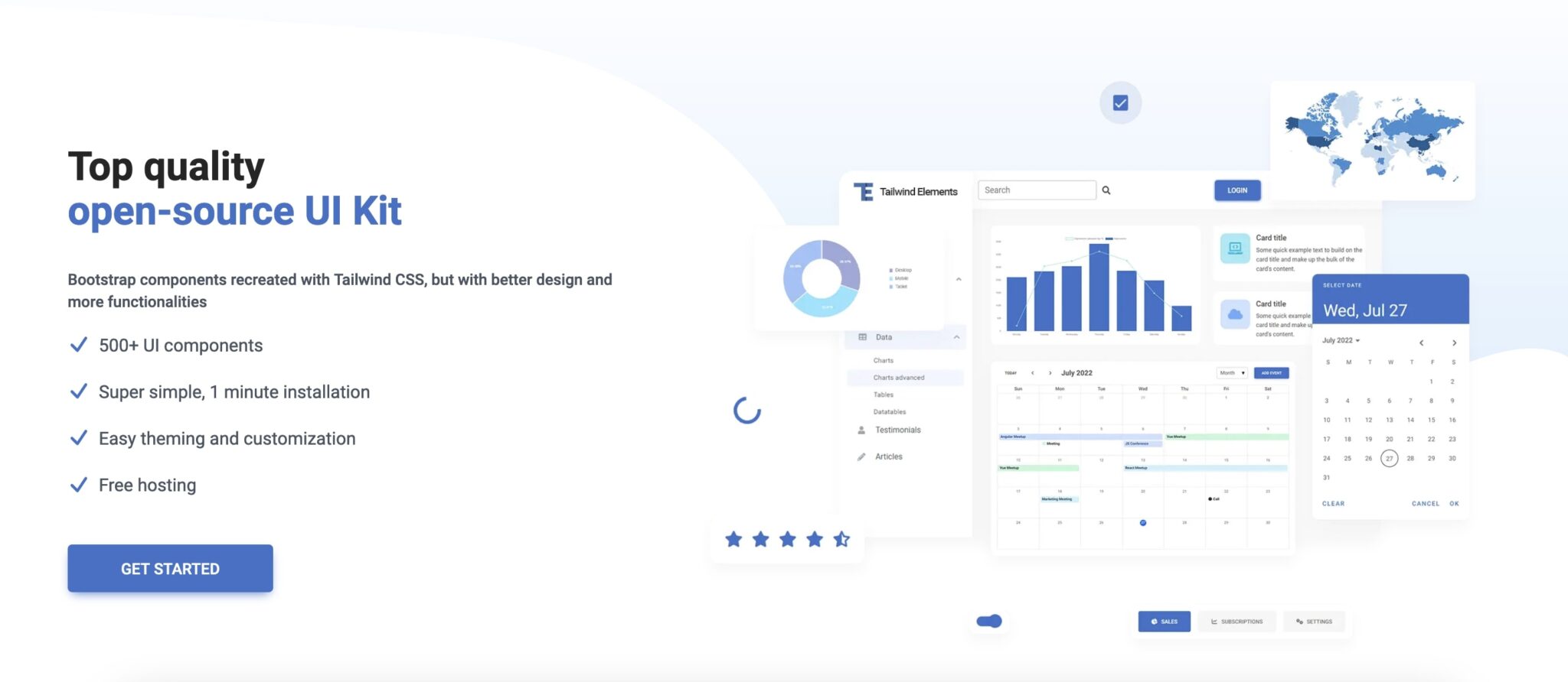
There are more than 500 UI components in Tailwind Elements. These components range from the most basic, such as headings, images, and icons, to the most complex, such as charts and complete forms.
It is only if your project is particularly simple that you might not want to use Tailwind Elements. If so, you might want to skip all the steps involved in installing and preparing Tailwind Elements and choose a simpler solution.
For more complex scenarios, you can also use Tailwind Elements blocks like articles, hero sections, mega menus, testimonials, features, and stats.
Tailwind Elements' documentation is very detailed, explaining how to install, configure, and optimize your Tailwind CSS project, as well as how to customize and theme it. Furthermore, it provides integration guides for Angular, React, Svelte, and Vue frontend frameworks.
The Tailwind Elements API is simple, powerful, and easy to use, allowing you to customize the components according to your needs.
There are more than 150 Tailwind CSS components and templates included in Mamba UI, which can be used with all major frontend frameworks, such as Angular, Vue, React, and Svelte.
If you want a fast, easy, and modern solution for your new or existing projects, Mamba UI is the perfect choice.

Kutty is a Tailwind CSS plugin that provides a set of accessible and reusable components for building various web applications. Before you can use it, you will need to install and configure it. It is as simple as copying and pasting the code for the components you want to use once it is installed.
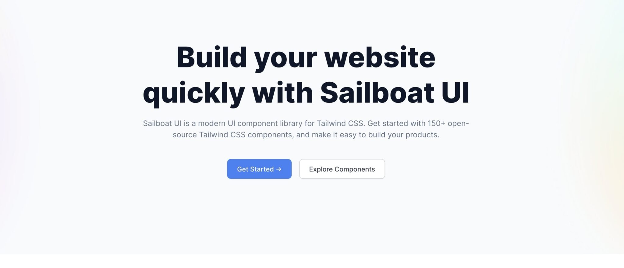
Using Sailboat UI, you can build apps and products with 150+ modern Tailwind CSS components. Each component comes with several variations.
For dynamic components, Sailboat UI uses Alpine.js by default; however, you can use any frontend framework you like. The documentation explains how to install and configure the project.
You just need to copy, paste, and customize the code for Sailboat UI components to use them in your project. I recommend picking another option from this list if you need something more customized and modern-looking, but this library is great as a foundation of well-styled components.
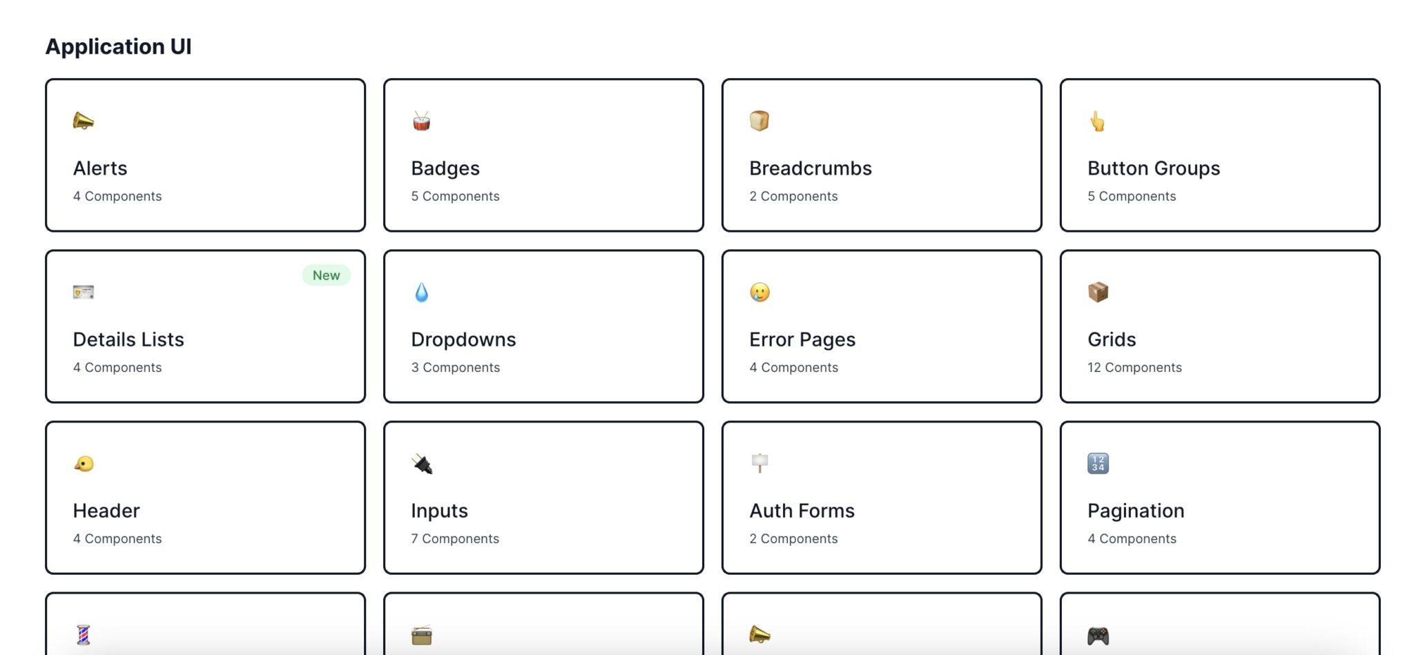
The HyperUI documentation allows you to preview components in different sizes, including mobile, small, medium, and large. Some components also support a dark theme, which you can preview.
Copy and paste the components into your project, then customize them further to meet your needs. Alpine.js is required for some dynamic components, such as dropdowns.
As a result, HyperUI is a great choice when you need a quick and easy way to prototype and build more complex interfaces.

It is easy to use Tailwind Starter Kit by copying and pasting the code for the components you want to use in your Tailwind CSS project - no complex installation is needed.
As they claim, the documentation is built by developers, for developers, making it easy to navigate and use. This kit also includes several starter sample pages to help you get started faster and easier.
The color swatches are placed below each component's example in the documentation to allow you to change the colors of the previewed components. You can also design and develop your project simultaneously with the kit, since it includes Sketch, Adobe XD, and Figma design files.
If your project is more complex and requires more components and options, then you should pick a more complex library, like Tailwind Starter Kit.
Integrating and using Tailwind CSS component libraries in your project is a breeze, thanks to its flexibility and modular nature. Once you've chosen the library that suits your needs, here are some simple steps to get started.
1. Installation: Begin by installing the library via npm or Yarn. Make sure you have Tailwind CSS installed as well, as most libraries rely on it.
2. Importing components: In your project's main CSS file, import the necessary components from the library. This can be done with a single line of code for each component.
3. Configuring styles: Customize the appearance of the imported components by modifying their classes in your HTML markup or dedicated style files.
4. Extending functionality: Many libraries offer additional utility classes that can enhance interactivity and responsiveness in your project. Explore these options to take full advantage of what they have to offer.
5. Testing and debugging: It's always recommended to thoroughly test each component before deploying them in production environments. Ensure that they function as expected across different screen sizes and browsers.
6. Documentation and support: Familiarize yourself with the library's documentation for detailed instructions on how to use specific features or troubleshoot issues that may arise during implementation.
By following these steps, you'll be able to seamlessly integrate and utilize Tailwind CSS component libraries within your own projects, saving time while also harnessing powerful UI elements! Happy coding!
Customizing and optimizing component libraries is key to creating a unique and seamless design using Tailwind CSS. Here are some useful tips for getting the most out of your component library:
1. Start with a plan: Before diving into customization, have a clear vision of what you want to achieve. Identify the specific elements you need to modify or enhance.
2. Utilize utility classes: Tailwind CSS's utility-first approach allows you to easily customize components by combining utility classes. Experiment with different combinations to achieve your desired look and feel.
3. Extend existing styles: Instead of reinventing the wheel, build upon the existing styles provided by the component library. Use Tailwind's "extend" feature to add new utilities or tweak existing ones without modifying the core codebase.
4. Create reusable components: Take advantage of Tailwind's ability to create custom configurations for commonly used components in your project. This not only saves time but also ensures consistency across your designs.
5. Optimize for performance: While customization is important, it's essential to optimize your component library for performance as well. Remove any unused utilities or styles that may bloat your final CSS output.
6. Try PurgeCSS: To further reduce file size and improve load times, consider using PurgeCSS—a tool that removes unused CSS from your production code automatically.
7. Test across devices and browsers: Always test your customized components on multiple devices and browsers to ensure they render correctly and maintain their functionality across different platforms.
8. Stay updated with documentation updates: Component libraries often receive updates and improvements over time, so make sure you stay updated with any changes or additions made in order to take full advantage of new features or fixes
By following these tips, you can effectively customize and optimize component libraries within Tailwind CSS while creating visually stunning designs tailored specifically for your project needs.
Resources for learning more about Tailwind CSS and its component libraries:
1. Official Documentation: The first place to start is the official documentation of Tailwind CSS. It provides comprehensive information on installation, configuration, and usage of the framework. The documentation also includes detailed explanations of all the utility classes and components available.
2. YouTube Tutorials: Many developers find video tutorials helpful for learning new technologies. There are numerous YouTube channels that offer step-by-step guides on using Tailwind CSS and its component libraries. These tutorials often cover topics like setting up a project, customization options, and best practices.
3. Online Courses: If you prefer a structured approach to learning, consider enrolling in an online course dedicated to Tailwind CSS. Platforms like Udemy and Coursera offer courses taught by industry experts who provide in-depth knowledge along with practical exercises.
4. Community Forums: Joining online communities can be a great way to learn from experienced developers and get answers to your specific questions about Tailwind CSS or its component libraries. Websites like Stack Overflow have active communities where you can post queries or browse through existing threads.
5. Open Source Projects: Exploring open-source projects built with Tailwind CSS can give you insights into real-world applications of the framework's features and components. GitHub is an excellent platform for discovering these projects as well as contributing to them.
6. Blogs & Articles: Many web development blogs regularly publish articles on various aspects of using Tailwind CSS effectively or highlight useful tips and tricks when working with component libraries based on it.
Remember that continuous practice is essential for gaining proficiency in any technology stack, including Tailwind CSS!
Choosing the right Tailwind CSS component library for your project is crucial in ensuring efficiency, consistency, and a seamless development process. With the wide variety of options available, you can find a library that perfectly fits your project's needs.
In this article, we have explored the top 12 Tailwind CSS component libraries and discussed their features, pros, and cons. Each library brings its own unique set of components and customization options to enhance your UI design.
Remember to consider factors such as community support, documentation quality, ease of integration, maintenance updates, and licensing when selecting a component library. Additionally, take advantage of resources like official documentation and online tutorials to learn more about Tailwind CSS and how to customize these libraries to suit your specific requirements.
By utilizing one of these top-notch component libraries in combination with the power of Tailwind CSS utility classes, you can streamline your development workflow while creating stunning user interfaces.
So go ahead and explore these amazing libraries! Elevate your projects with beautifully designed components that will save you time and effort. Take advantage of their extensive customization options to create unique user experiences that leave a lasting impression.

Full-stack developer with a knack for Merging creativity with technical expertise for standout solutions.
Beyond Code has developed Windy Tailwind, a remarkable tool for creating Tailwind CSS components from existing website elements.
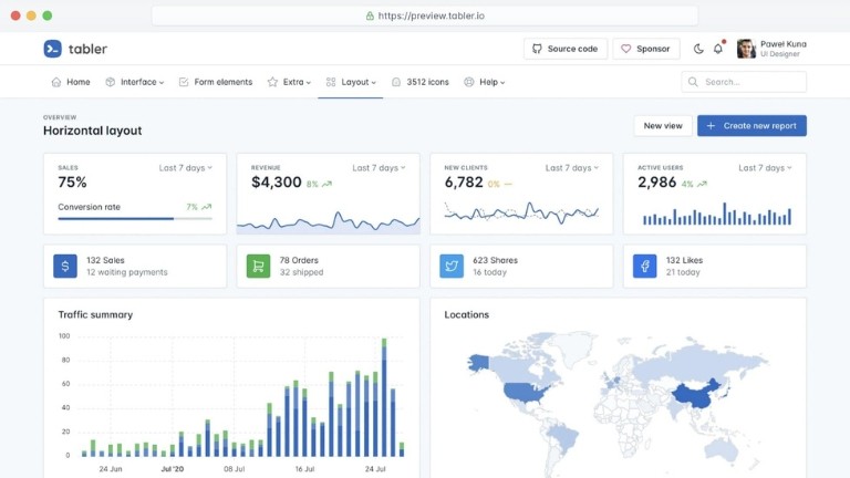
The Tabler dashboard template offers a clean, responsive, and highly customizable design. In this article, we'll take a closer look at what Tabler is and how you can use it.
A popular front-end framework for building responsive and attractive web applications, Bootstrap is probably familiar to web developers.
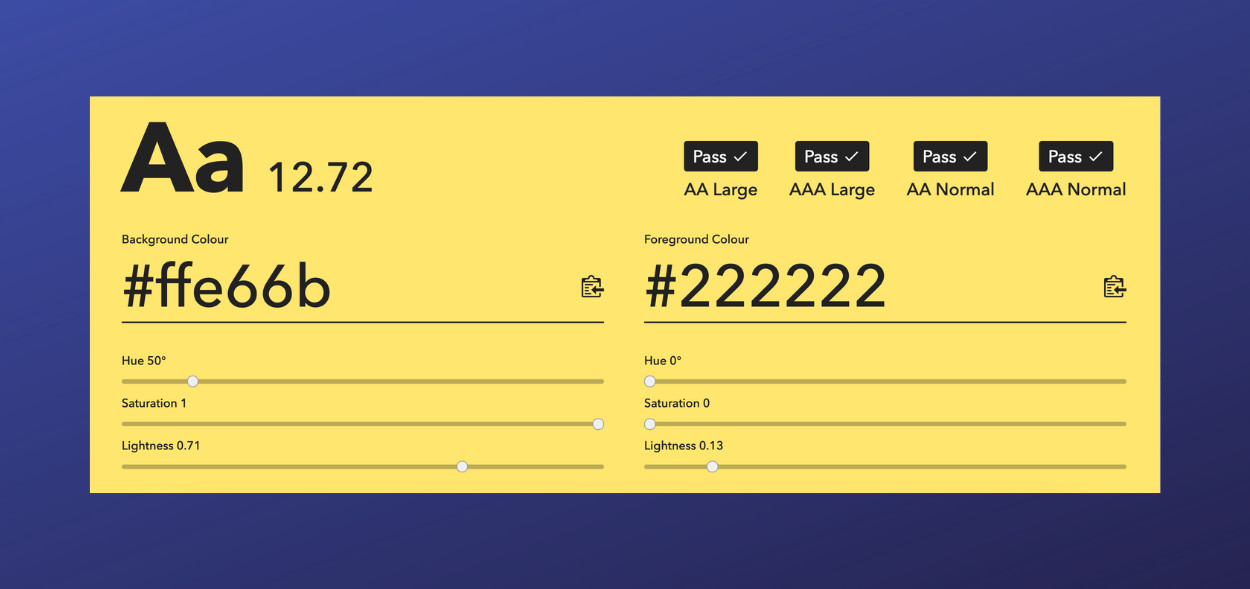
Colour Contrast Checker is a web-based tool aimed at assisting designers, developers, and anyone interested in ensuring their websites are between different colour combinations against WCAG standards
Subscribe for 20+ new Laravel tutorials every week
You can unsubscribe at any time. You'll also get -20% off my courses!